POS dashboard
This section covers
- What is the POS Dashboard?
- Accessing the dashboard
- How to Read the dashboard
- Frequently asked questions
What is the POS Dashboard?
The POS Dashboard is a dedicated analytics view in TreeAMS that displays real-time and historical data from your Point of Sale (POS) system through the POS Integration feature. It displays key metrics and ranks each unit by performance, making it easy to monitor and compare results at a glance.
📌 Note:
This dashboard is only visible to users who have an active POS Integration subscription. Access is managed by the Site Admin user role.
Accessing the dashboard
⚠️ Important:
If you cannot see the POS option in your dashboard menu, your account may not have an active POS Integration subscription. Contact your Site Admin to enable access.
Follow these steps to navigate to the POS Dashboard:
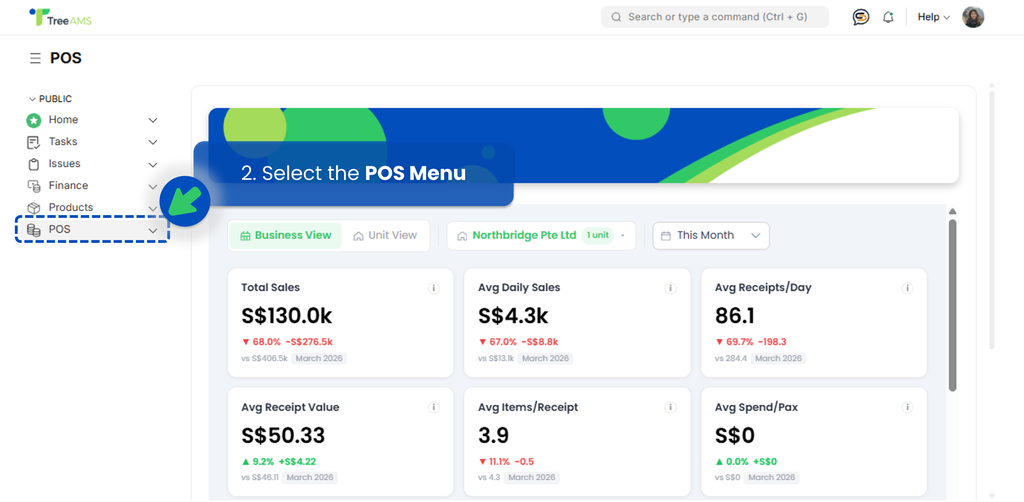
- Log in to your TreeAMS account and go to Admin Site (Desk). Learn how you can switch to Admin Site (Desk) here!
- From the left menu, select the POS menu directly (not the arrow beside it).
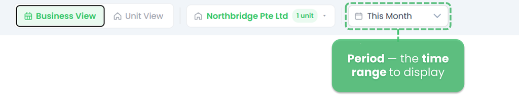
- The dashboard loads immediately. At the top, configure your view by setting:
- View — choose between Business View or Unit View.
- Business View
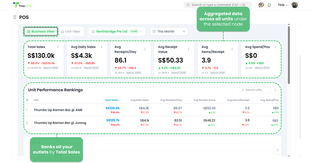
- Displays aggregated data across all units under the selected node.
- Selecting HQ reflects the combined performance of all units across the entire company.
- Selecting a Franchisee reflects all units under that specific franchisee only.
- Unit View
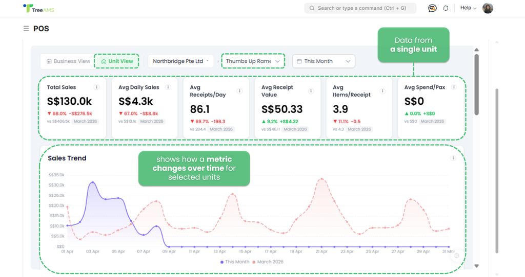
- Displays data for a single unit.
- Use this when you want to review the POS dashboard of one specific unit in isolation.
- Business View
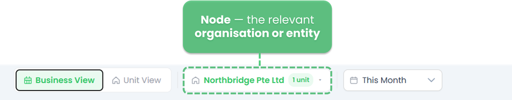
- Node — select the relevant organisation or entity
- Period — select the time range to display (e.g., This Month)
- View — choose between Business View or Unit View.
How to Read the dashboard
The POS Dashboard is divided into four main areas:
KPI summary cards
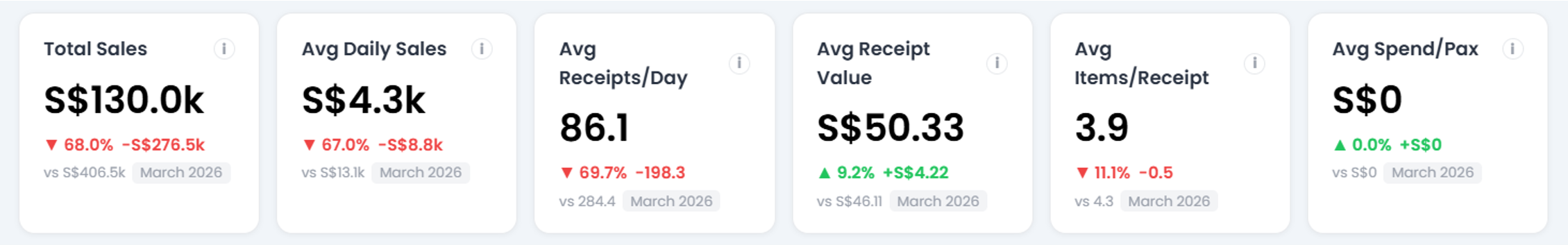
These six cards at the top give you a quick snapshot of your business performance for the selected period. Each card also shows a comparison (in percentage and value) against the previous month.
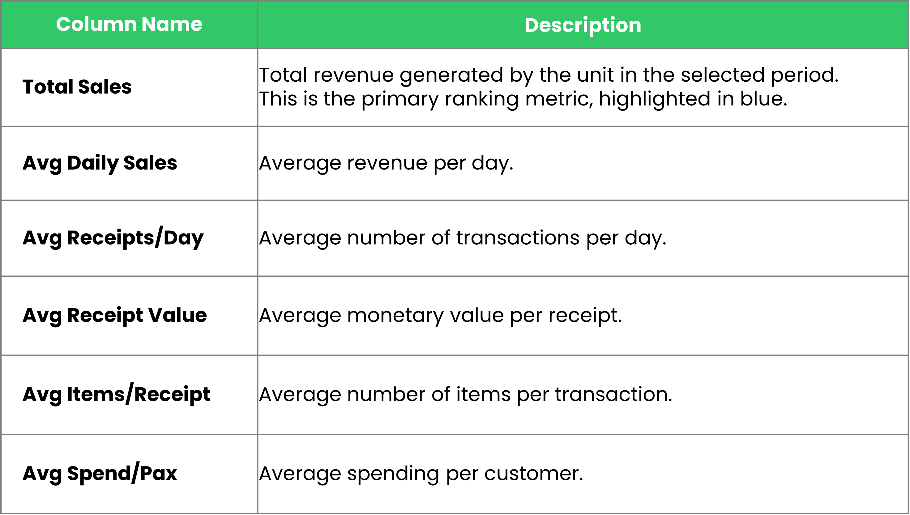
- Total Sales 👉 Total revenue collected through POS for the selected period.
- Avg Daily Sales 👉 Average revenue per operating day.
- Avg Receipts/Day 👉 Average number of transactions processed per day.
- Avg Receipt Value 👉 Average spend per transaction/customer visit.
- Avg Items/Receipt 👉 Average number of items per transaction.
- Avg Spend/Pax 👉 Average spend per person (requires pax data from POS).
📊 Reading the comparison:
A red arrow (▼) means the value is lower than the previous period.
A green arrow (▲) means it is higher.
The percentage and value shown are the difference vs the same metric last month.
Unit performance rankings
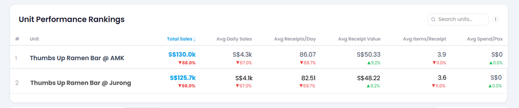
This table ranks all units under the selected node by Total Sales, from highest to lowest. Use it to compare how each unit is performing across key metrics within the same period.
Here's each column explained:
📊 Understanding the indicators
Below each value, a percentage and arrow indicate the change compared to the previous period:
- Red arrow (▼) — performance declined compared to the previous period
- Green arrow (▲) — performance improved compared to the previous period
Searching for a unit
Use the Search bar on the top right to quickly find a specific unit by name.
Unit Trends chart
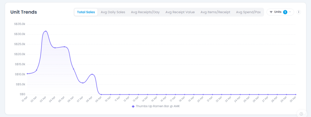
The Unit Trends chart shows the daily performance of a unit across the selected period. Use it to identify patterns, peak days, and drops in performance over time.
Switching metrics
At the top of the chart, select the metric you want to visualise:
- Total Sales 👉 daily revenue total
- Avg Daily Sales 👉 average sales per day
- Avg Receipts/Day 👉 average number of transactions per day
- Avg Receipt Value 👉 average value per receipt
- Avg Items/Receipt 👉 average number of items per transaction
- Avg Spend/Pax 👉 average spend per customer
Only one metric is displayed at a time. Click any tab to switch.
Filtering by unit
Use the Units filter on the top right to select which unit to display. The number badge indicates how many units are currently selected.
Reading the chart
- The X-axis represents each day within the selected period.
- The Y-axis represents the value of the selected metric.
- Hover over any point on the line to see the exact value for that day.
- A flat line at S$0 indicates no data was recorded for those days — this may mean the unit was closed or no POS transactions were made.
Top Items Overview
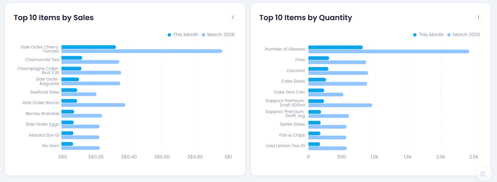
These two charts highlight your best-performing menu items for the selected period, helping you understand what sells the most in terms of both revenue and volume.
Top 10 Items by Sales
Ranks the top 10 items based on the total revenue they generated. Use this to identify which items contribute the most to your income — not necessarily the ones ordered most frequently.
Top 10 Items by Quantity
Ranks the top 10 items based on the number of times they were ordered. Use this to identify your most popular items by volume, regardless of their price.
Reading the bars
Each item displays two bars side by side:
- Dark blue — current selected period (e.g., This Month)
- Light blue — the previous month for comparison (e.g., March 2026)
Comparing the two bars lets you quickly see whether an item is trending up or down compared to the previous period.
💡 Tip: An item that ranks high in Quantity but low in Sales may indicate a low-priced but popular item. Conversely, an item high in Sales but lower in Quantity is likely a high-value item ordered less frequently.
Frequently asked questions
I cannot see the POS Dashboard in my menu. What should I do?
Your site does not have an active POS Integration subscription, or you don't have access as a Site Admin. Contact your Administrator or TreeAMS CSM to verify your subscription status and enable access for your account.
What does the red/green arrow next to each metric mean?
The arrow indicates the change compared to the same metric in the previous month. A green arrow (▲) means the metric has improved, while a red arrow (▼) means it has declined. The percentage and value beside the arrow show the exact magnitude of the change.
Can I export the POS Dashboard data?
The POS Dashboard itself does not have an export feature. However, you can export POS data by navigating to POS → Reports → Sales Report, where you can download the data you need.
Can I view data for a specific outlet only?
Yes. Switch to Unit View using the toggle at the top of the dashboard, or use the Units filter in the Unit Trends section to focus on one or more specific outlets.
Who do I contact if the data looks incorrect?
First, verify that your POS system is actively syncing with TreeAMS by checking the integration status in your settings. If data still appears incorrect, reach out to your Site Admin or the TreeAMS support team with the affected date range and unit details.